Insight
What do you see of C?

Wall painting in Berlin in the time of Covid-19.
Insight
Wall painting in Berlin in the time of Covid-19.
The power and effectiveness of infographics and information in times of corona
Infographics can do a lot. In light of the Covid-19 pandemic, visual representations of data or information can communicate facts and fight fear in an easy to understand way. Infographics explore, condense, and convey the facts as a narrative designed to increase awareness and understanding.
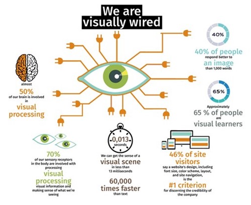
We are all visually wired, Design: Sabina von Kessel
There is proof that:
MIT neuroscientists have found that the brain can identify images seen for as little as 13 milliseconds. “The fact that you can do that at these high speeds indicates to us that what vision does is find concepts. That’s what the brain is doing all day long — trying to understand what we’re looking at,” says Mary Potter, an MIT professor of brain and cognitive sciences and senior author of the study. (2)
Approximately 65% of the population are visual learners. Subsequent studies have estimated that the proportion of visual learners to other learning styles is even higher, some as high as 80%, depending on the categories of learning styles used and the study methodology.
Humans have also a remarkable ability to remember pictures. Research has shown that people can remember more than 2,000 pictures with at least 90% accuracy in recognition tests over a period of several days, even with short presentation times during learning. This excellent memory for pictures consistently exceeds our ability to remember words. (3)
Furthermore, presentations using visual aids were found to be 43% more persuasive than unaided presentations. In particular, visual support has affected the perception of a presenter as being more concise, clearer, making better use of supporting data, more professional, more persuasive, and more interesting. (4)
What our eyes see can influence what we hear. This is called the “McGurk Effect”. There is proof that what we see overrides what we hear. (5)
Today’s news cycle is increasingly faster, busier and noisier. Infographics are visual representations of information, data or knowledge. They explain, compare, explore, add context, put figures in relation to each other, create an overview and zoom in on key details. They are an important tool in presenting information visually so that it's easy and fast to understand.
Moreover infographics are one of the most powerful ways to communicate complex data and to put them in perspective. They can tell any story – across all topics, platforms and channels – and leave users better informed.
Known as a data visionary, Hans Rosling (pictured above) promoted the use of data to resist the “overdramatic worldview” and explore development issues. He has shifted the perspectives of even the most worldly and well-traveled among us.
A professor of global health at Sweden’s Karolinska Institute, Rosling’s work focused on dispelling common myths about the so-called “Third World”, which, he pointed out is no longer worlds away from the West. In fact, most emerging economies are on the same trajectory towards health and prosperity, and many countries are moving twice as fast as the West did.
In his worldwide talks, Hans Rosling demonstrated how to use beautifully animated infographics that represent data to convey a fact-based worldview. (6)
Turning complex datasets into beautiful, simple infographics that tease out unseen patterns and connections and make complex issues understandable is British data journalist David McCandless’ passion: “I feel that everyday, all of us now are being blasted by information design. It's being poured into our eyes through the web, and we're all visualisers now; we're all demanding a visual aspect to our information. There's something almost quite magical about visual information. It's effortless, it literally pours in.” (7)
Infographics not only provide inspiration, correcting a worldview or telling a story with big data, in times of Covid-19 they are often designed to change (or comment on) behaviour. (8)
Using maps is a tricky business in this context, a world map suggests an overview, but as whole countries are coloured on the map, the whole country is visually declared a dangerous region, although there might be only a few cases of people who tested positive.
Infographics, like all representations, are never innocent or neutral reflections of reality. They represent an interpretation of our world. Our understanding of symbols and graphic language depends greatly on our cultural language.
There is very little uniformity between different cultures. Images need to connect with people’s perceptions and use forms and colors that connect to their culture. This is even more true with instructional illustrations telling people how to behave in the face of the worldwide pandemic. In India, for example, many rural people are illiterate and have no access to the internet and thus might not relate to the visual communication typically used in the internet.
Although my research has shown that illiterate people are very conscious about semiotics, abstract forms and colors, educational images should reflect cultural context and cultural customs extremely accurately.
The WHO’s Covid-19 infographics (illustrated above) use a stereotypical western visual language in an attempt to alter behavior. Moreover the WHO offers no culturally adapted signage and information on hygiene for the 2 billion people who lack clean water running from water taps. Alternative information on how to wash hands without running water is blatantly missing.
“Corona means crown. There is a crown on top of the virus if you look at it under the microscope,” says Lisa Maragakis, Senior Director of Infection Prevention at John Hopkins Health System.
On 26 January 2020 Dr. John Campbell from the WHO explained the effects of Covid-19 in a video and used a rather blurry unattractive looking black and white photo of multiple Covid-19 viruses.
The reason for the ugly looking Covid-19 is pretty basic: color is a property of light (i.e., photons), and since electron microscopes use an electron beam to highlight a specimen, no color information is recorded. The area where electrons pass through the specimen appears white, and the area where electrons don’t pass through appears black. (9)
Since then the virus has made a huge career in international media and its attractiveness achieved peak values.
Suddenly ‘photos’ of Covid-19 look colourful and interesting. The virus appears in green, swimming in a greenish environment and in another illustration on the same website in pink, hovering in a blue, underwater-like environment or outer space with other bluish satellites-like objects in the background. (10) The virus looks rather technical and like a flying object in space on a Canadian News site. (11) Other illustrations look like either my mother’s pin cushion, a beautiful underwater scene or made from plasticine. Some of the models seem to be hand-knitted or grown in a green house.
This is designer's hour because how the corona virus looks like and is represented in the media is entirely an interpretation by designers. (Apart from the ugly electron microscopes photos which scientists use.)
The artist who created beautiful C: “I love getting up every day not knowing what disease I will be working on next, but knowing I can help impact people’s health, safety, and security,” Eckert says. “It’s amazing to see your artwork reaching so many people and actually making a difference.”

Sabina von Kessel
Sabina von Kessel is the communications and design expert for Skills Initiative for Africa (SIFA), Funding Facility (more info here). Originally from Germany, she lived for more than a decade in India before moving to South Africa. Sabina has over 30 years of experience in the design of communication strategies and products and teaching visual communication. Her interest lies in a human-centered approach to design, applying theories and strategies of Social and Behaviour Change Communication.
sabina.vonkessel@skillsinitiative-for-africa.com
Tel: +27 (79) 387 66 70
Contact

